Trailer
How our Trailer follows conventions

|
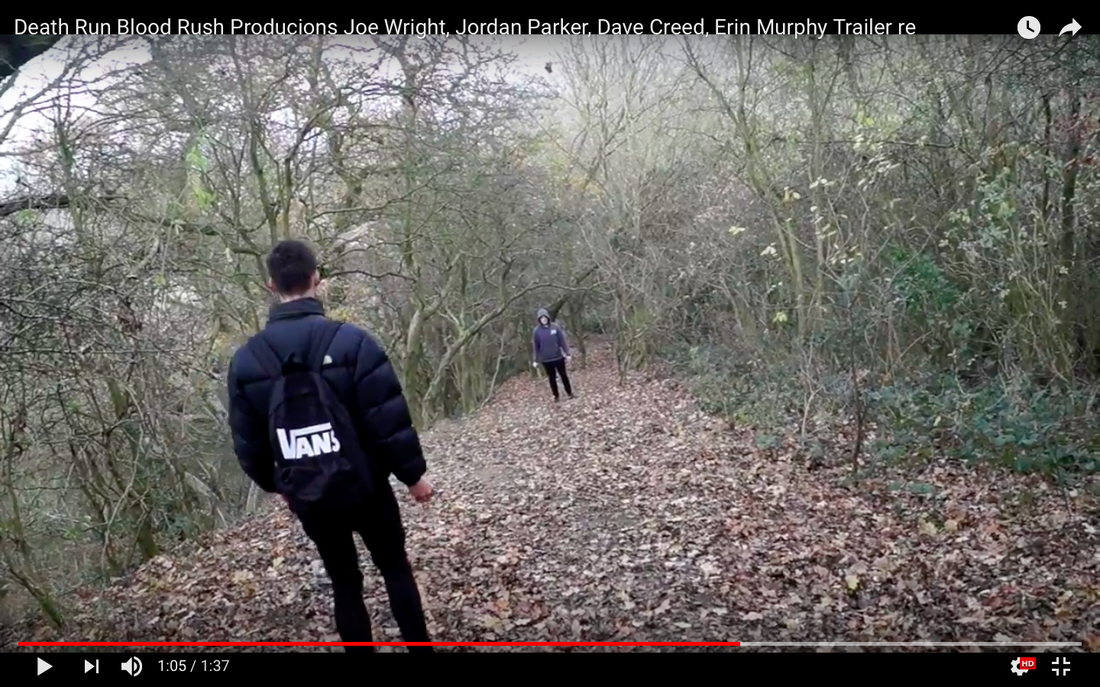
|
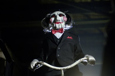
How our trailer develops conventions
|

|
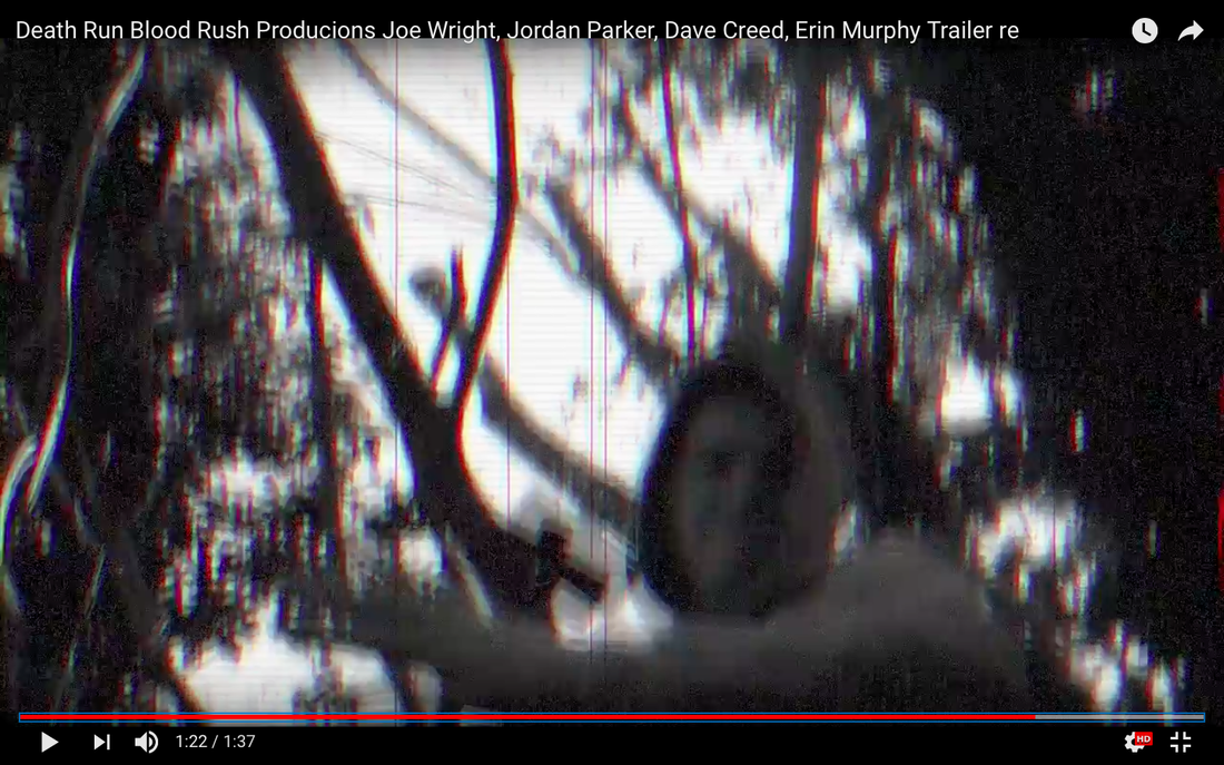
How our trailer changes conventions
|
|
|
|
Poster
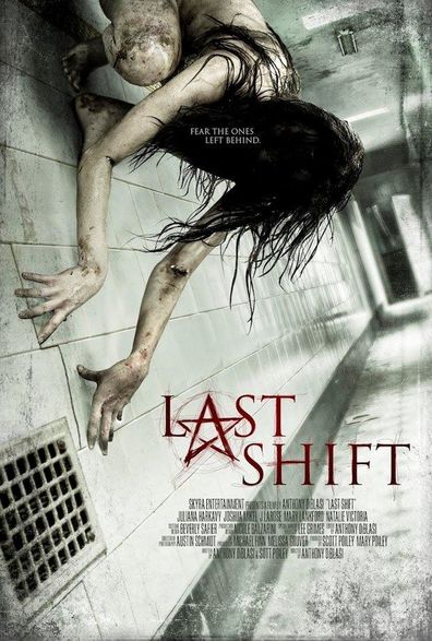
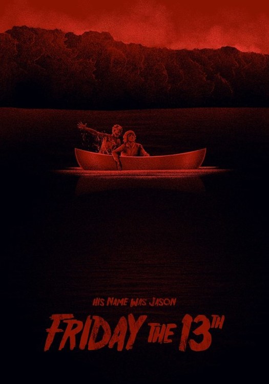
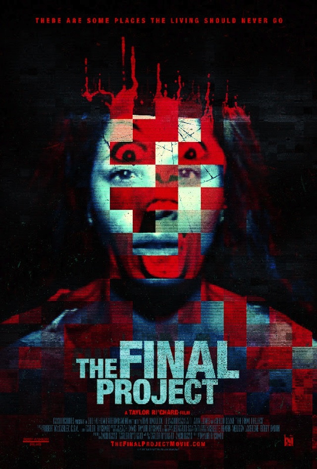
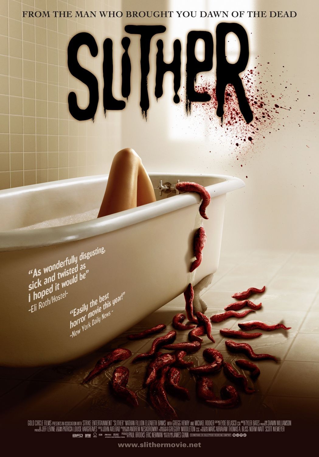
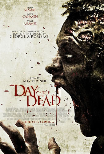
The making out of posts consistent of ideas around colour scheme, we wanted to have a look where it looks treating and also mysterious as this is the effect we want our trailer to have. Portraying these effects through a poster was challenging but we chose the colour scheme Black, White and Red. The black parts are to create a mysterious mood around the shot, blacking out ideas which would possibly give some certainly within the shot; also darkness and night are often used to create a scary atmosphere commonly in horror. The white is used in the hand to possibly reflect death. Finally red is associated with blood and danger, this is exactly what our trailer includes - making our poster a true reflection of our trailer. This colour scheme and overall aim of effect is also used in 'The Final Project' and 'Friday The 13th' both using a similar colour scheme which both highlight uncertainly, mystery and fear. Whereas in 'Slither' and 'Last Shift' they have bright colour scheme with allow of exposed areas, this doesn't follow our objective we want with out poster. So we chose the darker colour scheme as this suits the effect we were looking for better and would create the right impression about out trailer towards the target audience.
|
|
Our poster changes the conventions as we have a border of a recording camera, this links to out trailer as its all filmed my hand and is meant to have a vlog style to the trailer. This also includes a battery bar at the top which is low again pointing to signs that the end is near giving the audience a sense of uncertainty as they might not be able to see everything as the camera is the only way they have access to the story line. Commonly in posters there will be alot of blood whereas our poster has very little, this is because we wanted to focus more on the mysterious element of our poster rather than blood and gore.
|
|
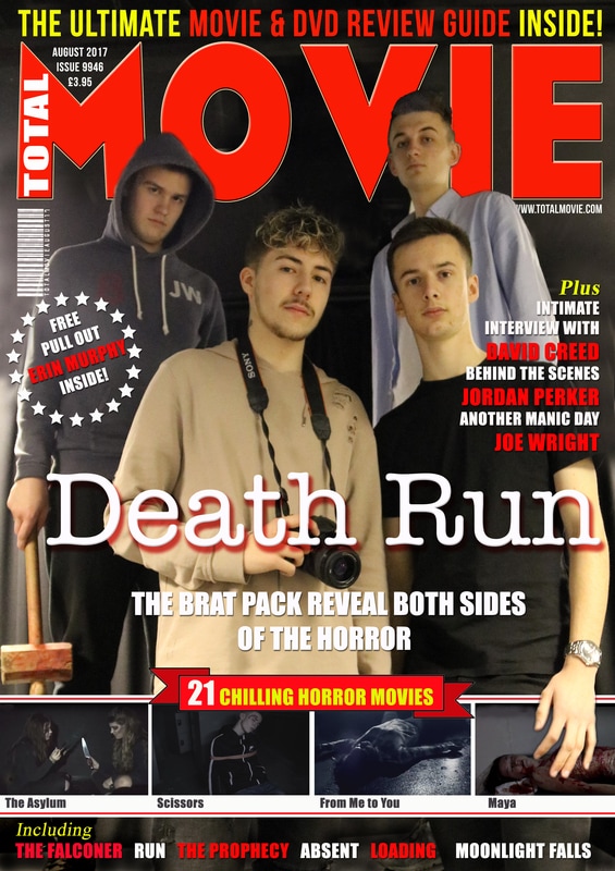
Our Magazine Cover